The former emblem was a blue flag with a cross of St George forming a horizontal "V" shape across the field.
 |
| Flag of the Flag Institute 1971 - 2016 |
It is a very good flag, there were however concerns that for a UK national organisation it was to English focused rather than British focused; and hence might discourage Scottish, Welsh, Northern Irish membership, that of any of the Dependencies and Overseas Territories.
A fair point as a non English, Briton my self I can say that I don't really identify with the Cross of St George on its own, however I also should say that the former FI flag did not put me off the organisation, and once I understood the symbolism of it representing the founding day I found it easier to identify with.
In 2015 the FI asked for submissions and ideas for a new logo or flag in their newsletter. I even sent in a design combining the Union Flag and Sheet bend know (international symbol of vexillology) in the form of an ensign. You can read about that post here.
The new flag is based on the lower quadrant of the Union Jack. Which is not at all surprising many nation vexillology organisation base their flags on their national flags or symbols.
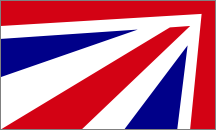 |
| New flag of the Flag Institute |
Although I already designed an alternative in the form of an ensign which would work as a flag, i thought I might try one that works both as a flag and logo.
I think the thinking behind both FI flags was good (although the end result of the new one wasn't), so I thought of combining them. A sort of Union Jack 'V' shape instead of a St George one. This is what I came up with:

I feel this works better as it is clearly based on and reflective of the Union Flag, but is distinctly different and dosn't look like someone just cut up a flag and ran it up a pole. Alternatively you could place the horizontal red bar in the fly with the 'V' pointing towards it to give the impression of a forward pointing arrow. Personally however I think the solid red bar looks better in the hoist.
I certainly think it works better as a flag when you compare it to this image of HQS Wellington (the FI postal address) i prepared:

No comments:
Post a Comment