This is a post I wanted to do a couple of days ago to mark the 99th anniversary of the battle of Cambrai (20th November 1917), but due to other priorities had to be put back till today.
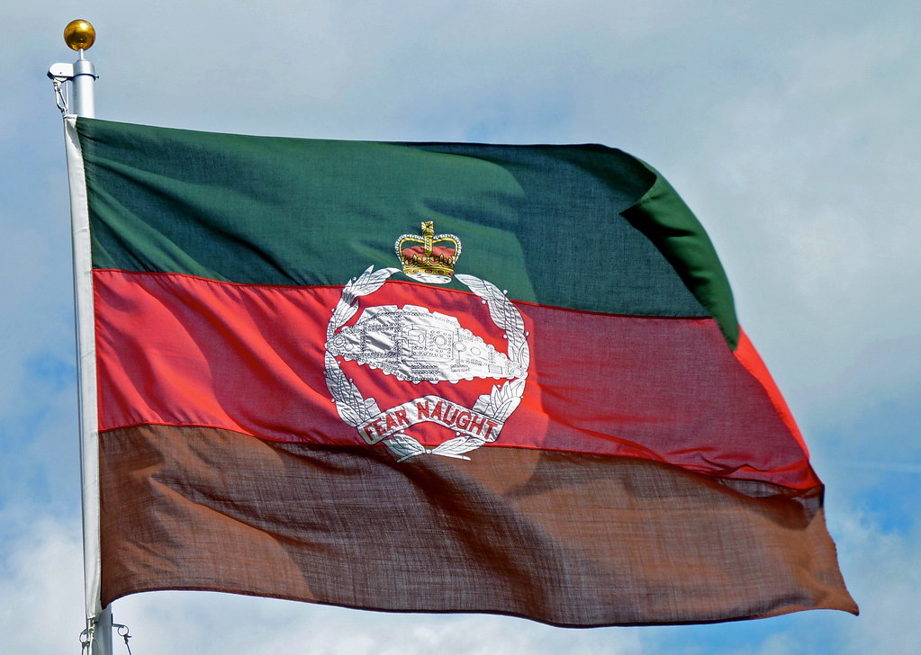
The Royal Tank Regiment is the oldest tank unit in the world, Originally known as the Tank Corps and then Royal Tank Corps before being given the title of regiment, was founded in the First World War to operate the new invention of tanks. The Camp flag of the regiment (not the ceremonial standard or colour) is a horizontal tricolour of green, red and brown and features the regiment's cap badge featuring an original tank.
This is one of my favourite military flags for a number of reasons. Its a simple pattern which minus the cap badge is confined to three colours, but mainly because of its history. It is the only camp flag of the British Army that I am aware of to be born in battle. Although not the first battle the tank was used in, the battle of Cambrai was the first where the tank played a decisive role being deployed in large numbers and achieving a breakthrough. The flag came from the Corps Commander Brigadier General Elles. When formed the Tank Corps had no unique colours or insignia, Brigadier Elles who lead from the front wanted something to distinguish his tank as the command vehicle, and decided to use a flag. After purchasing some coloured silk in town a homemade flag was stitched together and flown from the General's tank in the battle.
To the Green Fields Beyond, Cambrai, France, 20th November 1917 by David Pentland. Print can be purchased here
The colours of the flag are said to symbolise "from the mud of the trenches (brown), through the blood of the battlefield (red) and breaking through to the green fields beyond." However in reality the colours bore no significance in the battle. The flag was solely intended for the practical purpose of distinguishing the lead tank. The colours of the flag were a result of the limited coloured material available, and the symbolism attributed to the colours after the battle. The flag is still used in the camp flag of the RTR and is part of its history and tradition. More about the RTR including the flag can be seen in the short documentary seen here.
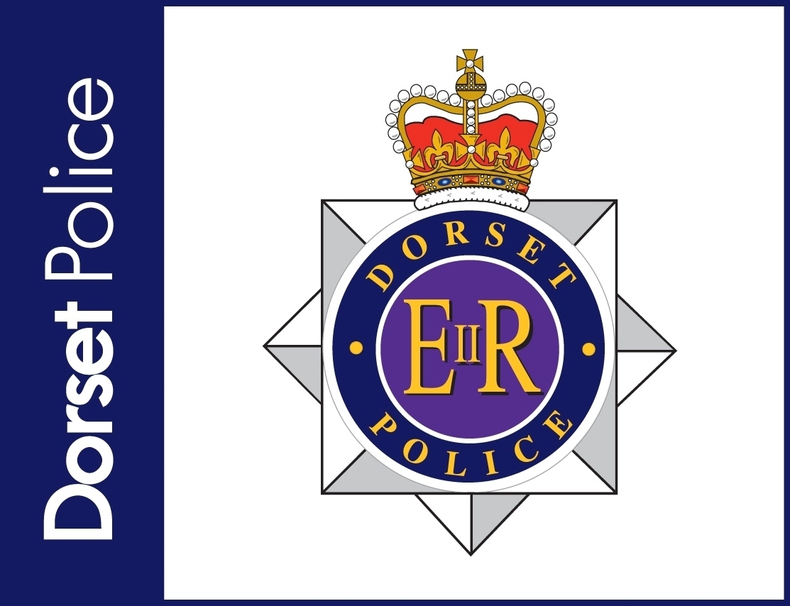
As far as British police badges go, most are pretty good, but I think some are rather generic. Most feature an eight pointed star generally (but not always) topped with a crown. In the centre of the star is a circular disk, with the name of the police force around it. Most have some sort of local or specific insignia in the centre but lots just have the Royal EIIR cypher. Personally I don't think the cypher is needed as the monarch and state is already represented by the crown. Here are just a few redesigns where I have replaced the cypher with something to represent the local area or region, starting with the largest police force in Britain,London's Metropolitan Police Service.
The Gwent police badge is slightly different, it is based on the Gwent banner, but with some slight differences mainly the dragon to distinguish it as this police force's jurisdiction expands beyond Monmouthshire. I also kept the Welsh text on the badge:
However I realize that the figure represents Robin Hood and felt it might be a bit ironic for the badge of law enforcement to feature an outlaw! So I also offer an alternative featuring the cross from the flag:
Other badge redesigns are that of the Ministry of Defence Police (not to be confused with the Royal Military Police which is a corps of the army) and Her Majesty's Inspectorate of Constabulary whose job is to police the police.
The MoD police badge redesign simply features the tri-service emblems of the swords (army), anchor (navy), and eagle (air force):
HM Inspectorate of Constabulary's badge redesign features a shield bearing scales of justice, the royal cypher and an olive wreath. However I consent that in this case it might be appropriate to just use the royal cypher as is done in the present badge.
But perhaps the law enforcement organisation in need most of a badge redesign is the National Crime Agency (NCA) the British equivalent of the FBI. Although their current logo might work well as a logo, it doesn't really work as a badge, so this is my proposal:
It features the eight pointed star common to nearly all UK police forces, the crown and the royal arms to demonstrate its national jurisdiction.
Hi all I am pleased to be back blogging, I have finished the print publication I mentioned and it is currently being submitted to potential publishers, I will of course update the blog on progress.
The world has today been focused on the result of the American presidential election, but there was another significant referendum in the United States yesterday that went largely unnoticed. The capitol Washington DC voted in a referendum to become a state. Although this of course has to be approved by congress, which may or may not happen. Washington DC is not part of a state so has no representation in Congress. This video helps explain:
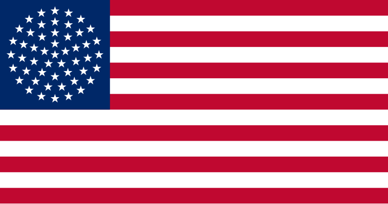
If this application for statehood is approved it would make Washington DC the 51st state of the United States of America. If American tradition is followed then a star would be added to the canton of the US flag. Since 1960 the US flag has had an even and symmetrical 50 stars which an extra star would mess up, so what patterns could be used? The Puerto Rico statehood movement use a circular design, which harks back to the Betsy Ross design of the early US flag, except it now forms a sphere.
The problem with this is that some people don't think that there should be a star in the centre of the formation, as this would imply that some state or states are more important than others rather than equal.
There are two other drafts that have been suggested, one with a "checkerboard" pattern
Another draft has a hexagonal pattern:
I personally think this looks odd but perhaps thats because I am so used to seeing a symmetrical canton.
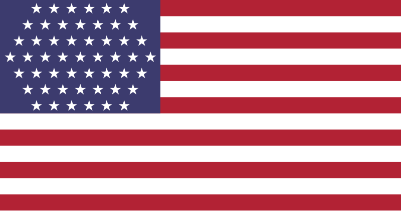
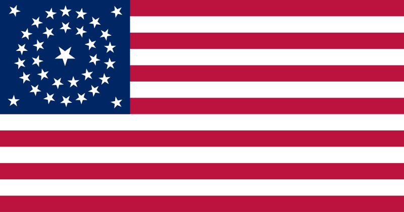
I like the Puerto Rico design. I think it tries to go back to the modern US flag roots of the Betsy Ross flag, however I think they went about it wrong. The hollow circle of stars a symbol of unity the world over possibly inspired by early American flags, notably in the European and African Union Flags. So my idea reverts to the hollow circle. Of course 51 stars is too many to fit into a single circle, but I was inspired by a variant of the 34 star flag (1861-1863) that made use of two circles:
This is my design for a 51 star Betsy Ross style US flag:
It keeps a symmetrical pattern, and all the stars are equal. In order to accommodate all the stars I had to make them a bit smaller and expand the blue canton so it now touches 9th red stripe instead of the 8th white stripe. As the hollow circle is a symbol of unity which is what the USA is probably in need of now I think the change is worth it and I think it works rather well, at least until Puerto Rico or another territory becomes a state and we need a 52 star flag lol.


.jpg)