Showing posts with label Brazil. Show all posts

Tuesday, 1 April 2014

Allied Nations (WW2)

I don't know where I got this idea from but it occurred to me a while ago that the Allies of the Second World War, didn't really have a shared unified symbol. This is in contrast with most modern international organisations and alliances both military and non military alike, most of whom like the United Nations (UN), European Union (EU), North Atlantic Treaty Organisation (NATO) etc all of whom use their own flag.
Indeed this does seem odd as flags are prominent in both American and British Empire & Commonwealth propaganda posters from the period.
 The real purpose of these posters are clearly to evoke national and patriotic pride.
Its not only in a national setting flags were used but also international, if you look at the fallowing posters:
 For those interested some of the flags in these posters include: United States, United Kingdom, Soviet Union, China, Australia, Belgium, Brazil, Dominion of Canada, Costa Rica, Cuba, Czechoslovakia, Dominican Republic, El Salvador, Ethiopia, Greece, Guatemala, Haiti,  Honduras, Empire of India, Luxemburg, Mexico, Netherlands, New Zealand, Nicaragua, Norway, Panama, Philippians, Poland, Union of South Africa and Yugoslavia. The absence of France is unusual!

 
As can be seen from these posters the theme of unity and international friendship & cooperation seem to be key, and judging by the use of flags to demonstrate this, one wonders why an official flag wasn't adopted to demonstrate this?
After all the Allies did use shared symbols and insignia to easily identify each other such as the Invasion Stripes on aircraft, and by June 1944 all Allied vehicles in the North West Europe theatre had adopted the American style white star, sometimes in a broken or unbroken circle.
So taking this into account it does seem strange that no flag was ever adopted by the Allies. Well there were some flags used during the Allied occupations of Germany and Japan after the war, primarily to identify ships of the occupied country:

Flags of occupied Japan (left) and Germany (right)
There also seems to have been celebration flags possibly used by liberated civilians that featured allied flags, however these cannot be considered flags of the alliance itself:
 

Perhaps the closest thing to an Allies flag is the United Nations Honours flag, that was primarily used unofficially/semi-officially by the victorious allies seeking universal peace and attempting to establish the modern United Nations (the Allies were already calling themselves the United Nation in WW2):

 A design symbolising the "four freedoms" from a speech by US President Franklin D Roosevelt it seems to have actually had limited use by Britain and particularly America from 1943-48. It is also thought of as the first United Nations flag although it was never officially used in that role.
I decided to design an Allied Nations flag, as I think although it may not be physically needed, there still is potential for one, video games, documentaries, joint and international commemorations are but a few examples of how it could be used.
My first design features a white "V" separating a red and blue field with the white vehicle star.

The reasoning behind the colour scheme is that most of the Allied national flags have a red, white and blue colour scheme and most of the ones that don't have at least one of those colours on their flag. The "V" represents the V sign used to symbolise victory/freedom during WW2. The white star on green being used as a common symbol, as it was used by most of the Allies and was certainly recognisable to all of them.

The second design features a blue diamond on a red, white and black striped field with a circle of stars:

The red, white and black stripes reflect the United Nations Honours flag and the Invasion Stripes of Allied aircraft. the circle of stars represents unity (but not specific nations). The colour scheme and vehicles star have the same symbolism as the first flag.
Or alternatively the vehicle star could be replaced with a V symbol:
Gold replaces white in this example but white could also be used. 

Please Feel Free to comment.

Thursday, 3 October 2013

Brazil Coat of Arms (link)

A while ago I posted about the coat of arms of Brazil, fallowing a discussion on the Flags Forum.
Well my friend from the forum Leonardo Piccioni has made a most excellent design, that is a must see if you are interested in the topic. The link to his blog is here.

Friday, 19 April 2013

Armed Forces Flags (Brazil)

This was very much inspired by a post on the blog of a fellow vexillology fan, Leonardo Piccioni. He made a suggestion for the flag  Joint Staff of Armed Forces (Estado-Maior Conjunto das Forças Armadas or) See Here. I thought I'd go a little further and make flags for the individual armed services. 


 Exército do Brasil (Brazilian Army)

 First is the ceremonial standard of the army. For the one currently used see here. I did little to improve it but what I did do makes a big difference:

I used the army coat of arms, but I only used the shield and motto. I also used a blue, red, blue field as these are the traditional colours of the army, (which I find amusing as they are also the colours of the British Foot Guard regiments.) It also has the ceremonial streamers in the national colours and emblem, which I find charming. 
The non ceremonial flag for the army is below:
The inspiration is the national flag. Unlike the flags of the other armed forces, I didn't use the traditional colours colours, but kept a green field. The reason for this is green is used to represent the army on the joint staff flag. 
Next is the command flags. The flag for commander of the army features the coat of arms and traditional colours see here. My version is below:
It does conform to the same layout, but I decided to use a banner of arms at the hoist rather than the full coat of arms. I also change the colours at the fly to the national colours, as red and blue are already in the banner of arms in the hoist. 
There are two flags for chief of the Office of Commander of the Army, depending on if the officer in that position is a Brigadier General or Major General. See Here. For purposes of simplicity I decided to use one flag regardless of rank:
This has the army flag (non ceremonial) at the hoist and the colours at the fly. 
The rest of the command flags I think work okay and don't need changed, you can see them here.

Marinha do Brasil (Brazilian Navy)

The Brazilian Navy uses the national flag as its ensign, and the Cruzeiro as the Naval Jack. See Here. The flags that I am proposing are either Command Flags and Pennants or for use on shore. For example the cerimonal standard of the Navy. See Here. My proposal is below:
Rather than a silver/grey field I think white is more appropriate. I also added a blue boarder with the stars from the naval jack, and the ceremonial steamers, other than that I have changed very little. 
The non ceremonial flag of the navy is below. This flag would be used on shore bases or in unoffical ways like sporting events etc.  
Inspired by the national flag, it has a white field with a blue diamond with the insignia of the navy. the text could be removed.
The Navy I feel has a lot of rank flags which are very similar and in my opinion very easy to be mistaken. See Here. So here are my alternative proposals for the senior officials:
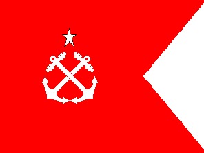
The flag of Commander of the Navy is white so that it stands out. I took away the star emblem and moved the anchor to the canton.

The Chief of Staff of the Navy is almost exactly the same but with the crossed anchors moved to the canton.
I did the same thing for Commander of Naval Operations. Moved the anchor to the canton.
the Admiralty flag I took away the anchors and simplified the star in the canton by removing the southern cross design. 
The flag for Commander in Chief of the Fleet, is the same as the admiralty but I added an anchor. there is also a flag for patron of the navy but since this seems to be a ceremonial flag I decided not to change it. 
I also simplified the rank flag of flag officers. Some of the flags differ depending on if the officer is in command or not. As the senior rank would be in command I think this is a little pointless. So to keep things simple my flags represent rank only. I also used a star system which is simple but easy to identify in rough weather or combat compared to the current flags.
Admiral of the Fleet
Admiral
Vice Admiral
Rear Admiral
I assume a Commodore would have a single star?
Staying with the navy is the flag of the Corpo de Fuzileiros Navais, (Corps of Naval Fusiliers)  the Brazilian Marine Corps:
 Again I have changed very little from the current flagIn fact what I have changed is really down to personal preference. I moved the star to the canton and the coat of arms to the bottom corner of the fly end.
The rank flags are similar to the naval ones so my alternatives are also similar, but are red to distinguish them as marines.
Commandant-General of the Marine Corps
Vice Admiral commanding a force of Marines
Rear Admiral commanding a force of Marines
Captain commanding a force of Marines
Commander or Lt Commander commanding a force of Marines

Força Aérea Brasileira (Brazilian Air Force)

I was unable to find any ceremonial standard of the Air Force so my design is completely original: 
It features a sky blue field with a dark blue diamond on which is the coat of arms of the air force. Again the inspiration was the national flag. The diamond has a green and gold boarder. 
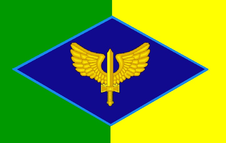
The non ceremonial flag is based on the Air Force Fin Flash:
It also has a blue diamond but with the Air Force insignia rather than the full coat of arms. 
Like the army the rank flags and flags of senior offices are very good and I wouldn't change. However I would change the flag of Commander of the Air Force:
Similar to the current one but with the aircraft roundel rather than coat of arms symbolising the Air Force.
To see the current rank flags click here .

Please Feel Free to Comment


All proposal  on this page in this post are designed by me


Wednesday, 19 December 2012

Coat of Arms of Brazil

This is not about flags as such but a flag related item, coats of arms.
My friend from the Flags Forum  Leonardo Piccioni has created a forum in the Heraldry section concerning the coat of arms of his native Brazil. The current 'coat of arms' for Brazil is below:
This is the Republic's emblem, used since 1889, but Leonardo's concerns are it isn't a coat of arms properly: it hasn't even a shield. It contains the Southern Cross, a national emblem, and a star to each state, over a star gironny in vert ("sinople" in original text) and or, bordered in red. The supporters are a coffee branch and a tobacco branch, and have been used on various historic coats of arms for Brazil.
To see the discussion on the flags forum and historic Brazilian coats of arms click Here.
To read more on the coat of arms past and present click here
Leonardo's proposal is below:
brasil-coat-of-arms.png
Designed by Leonardo Piccioni
This design keeps the supporters and places the central design of the present arms in a heraldic shield thus making it a 'proper' coat of arms. 

I also believe that as Brazil is such a large country and a top world stage player, and because it is hosting important spots events like the next football World Cup and Olympics the country deserves a 'proper' coat of arms.
My idea was to base the coat of arms on the badge of the Brazil Football Confederation (CBF) which is worn by the world famous Brazil international football team:
I don't know what significance if any it has, and Leonardo doesn't know either and suspects that it has evolved to its current form over time from a operate logo. See Here.
All the same I think it would be a good idea to use it as it is recognisable not only in Brazil but world wide thanks to the exploits of Brazil's footballers.
My first idea is below:
It has the shield design from the CBF and all the stars for the states. The Supporters are the same. There is also a crest which is a mullet gironny of ten vert, southern cross and olive crown (a republican symbol)
Leonardo suggested the use of 21 stars (the number of state when Brazil became a republic) as its easier
 to work with and is the number of stars on the Brazil Naval Jack. He also suggested the removal of the southern cross and olive crown, which I agree with.
brasil-coat-of-arms1.png
improved design by Leonardo Piccioni
I also suggest the use of Parrot supporters (I originally wanted to use the national bird of Brazil Sabiá-laranjeira, or the Rufous-bellied Thrush but this was beyond my skills) I also suggested using a motto and including the Southern Cross, or armillary sphere design from the flag and use the old supporters on this. I sort of coat of arms within a coat of arms:
The motto translates to 'Order and Progress' and 16 November 1889 (the date Brazil became a republic). The countries full title is also present 'Federal Republic of Brazil' 
I also made another version with the floral supporters being the main supporters and the armillary sphere, if pre fared:
These two would be my favourite. 
All Comment mine.

All proposals by Samuel McKittrick unless stated otherwise. 


Wednesday, 26 September 2012

City of Natal

My friend from the Flags Forum Leonardo Piccioni published on his blog some ideas for a new flag of Natal. Natal is the state capitol of the Brazilian state Rio Grande do Norte. The current flag is below:
The Coat of arms has a meaning. Natal means Christmas, reflecting on the date the city was founded. The star design appropriately depicts the star of Bethlehem, The biblical star that led the magi to the infant Jesus Christ. Leonardo noticed some Brazilian heraldic rules were broken by these arms. Acording to him they are as fallowed: 

  • The mural crown shows nine visible towers, while, by a standard inherited from Portuguese settlers, a city should use a mural crown with five visible towers.
  • Being Natal the capital city of  Rio Grande do Norte, this mural crown should be golden, in recognition of this special status.
  • The coat of arms is placed in a English shield shape, while a Spanish escutcheon should be rather used.
The obvious solution is a banner of the coat of arms but where would the fun be in that?
Leonardo's design simply corrects these errors:
designed by  Leonardo Piccioni

I have taken this further and made a couple of new designs. The first designs feature both a simple version of the arms showing only the shield and a version with the full coat of arms. 
The first one takes the colours of the current flag and forms a green and white vertical field rather than horizontal with the arms at the hoist separating the two colours. 


The next design really is based on the current flag with the arms moved towards the hoist which I think works better when the flag is in use than if they were in the centre. 


The next flag is based on the American stars and bars flag. but with the bars changed to green and white and the banner of the coat of arms in the canton. 

Again I took this one step further with moving the banner of Natal to where the white bar is and placeing the state flag in the canton. Now the state flag I used is not the official state flag but a proposed replacement designed by Leonardo. The reasons I used this are:
  1. In my opinion it is better than the current flag.
  2. It works better in my flag than what the current state flag does.

I also thought when making this why stop at state? Why not put the Brazil flag in?

The problem I have with this is that the Brazil flag is too complicated and the colours don't work, but this can easily be corrected. 
In this design I simplified the Brazil flag by removing the stars and the text. and changed the blue in the field to match that in the canton. I did not change the green as I think it works better with too shades to make the canton stand out from the flag. 

All designs are mine unless stated otherwise. Comments are appreciated. :)