Tuesday 22 November 2016

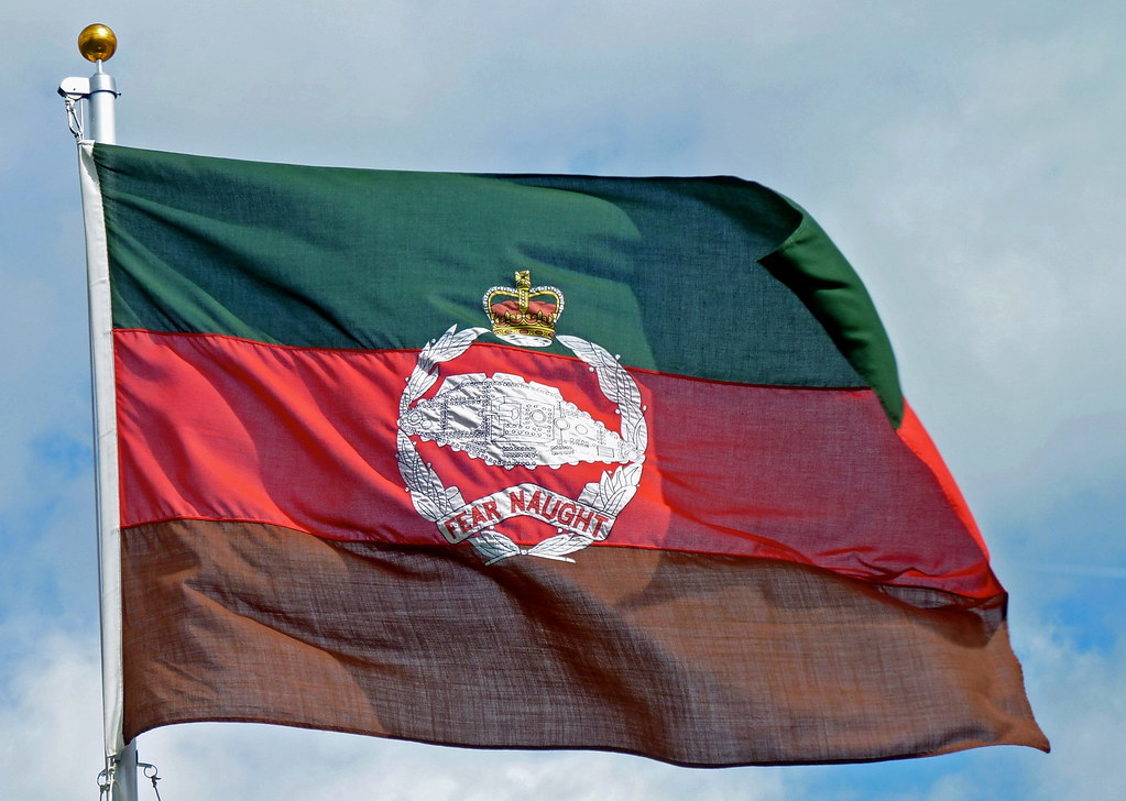
Royal Tank Regiment Camp Flag

This is a post I wanted to do a couple of days ago to mark the 99th anniversary of the battle of Cambrai (20th November 1917), but due to other priorities had to be put back till today.
The Royal Tank Regiment is the oldest tank unit in the world, Originally known as the Tank Corps and then Royal Tank Corps before being given the title of regiment, was founded in the First World War to operate the new invention of tanks.  The Camp flag of the regiment (not the ceremonial standard or colour) is a horizontal tricolour of green, red and brown and features the regiment's cap badge featuring an original tank. 
This is one of my favourite military flags for a number of reasons. Its a simple pattern which minus the cap badge is confined to three colours, but mainly because of its history. It is the only camp flag of the British Army that I am aware of to be born in battle. 
Although not the first battle the tank was used in, the battle of Cambrai was the first where the tank played a decisive role being deployed in large numbers and achieving a breakthrough.  The flag came from the Corps Commander Brigadier General Elles. When formed the Tank Corps had no unique colours or insignia, Brigadier Elles who lead from the front wanted something to distinguish his tank as the command vehicle, and decided to use a flag. After purchasing some coloured silk in town a homemade flag was stitched together and flown from the General's tank in the battle.
To the Green Fields Beyond, Cambrai, France, 20th November 1917 by David Pentland. Print can be purchased here
The colours of the flag are said to symbolise "from the mud of the trenches (brown), through the blood of the battlefield (red) and breaking through to the green fields beyond." However in reality the colours bore no significance in the battle. The flag was solely intended for the practical purpose of distinguishing the lead tank. The colours of the flag were a result of the limited coloured material available, and the symbolism attributed to the colours after the battle. The flag is still used in the camp flag of the RTR and is part of its history and tradition. More about the RTR including the flag can be seen in the short documentary seen here.


Friday 18 November 2016

UK police badge redesigns Part 1

As far as British police badges go, most are pretty good, but I think some are rather generic. Most feature an eight pointed star generally (but not always) topped with a crown. In the centre of the star is a circular disk, with the name of the police force around it. Most have some sort of local or specific insignia in the centre but lots just have the Royal EIIR cypher. Personally I don't think the cypher is needed as the monarch and state is already represented by the crown. Here are just a few redesigns where I have replaced the cypher with something to represent the local area or region, starting with the largest police force in Britain,London's Metropolitan Police Service.
It uses the Westminster portcullis which appears on the Met's coat of arms.
For the Bedfordshire police I used the Bedfordshire coat of arms:
The Cumbria police badge features the white Grass of Parnassus flower found on both the flag of Cumberland (often mistaken for Cumbria) and the Cumbria flag.
Dorset Police badge design features a Dorset flag shield:
Likewise the Gloucestershire police badge features a county flag shield:
The Gwent police badge is slightly different, it is based on the Gwent banner, but with some slight differences mainly the dragon to distinguish it as this police force's jurisdiction expands beyond Monmouthshire. I also kept the Welsh text on the badge:

the Humberside police badge is also based on a coat of arms but differs slightly:


The Merseyside police badge redesign features three mural coronets from the Merseyside flag:


The redesign for the Nottinghamshire police badge featured the shield from the centre of the Nottinghamshire flag:
However I realize that the figure represents Robin Hood and felt it might be a bit ironic for the badge of law enforcement to feature an outlaw! So I also offer an alternative featuring the cross from the flag:
Other badge redesigns are that of the Ministry of Defence Police (not to be confused with the Royal Military Police which is a corps of the army)  and Her Majesty's Inspectorate of Constabulary whose job is to police the police.
The MoD police badge redesign simply features the tri-service emblems of the swords (army), anchor (navy), and eagle (air force):
HM Inspectorate of Constabulary's badge redesign features a shield bearing scales of justice, the royal cypher and an olive wreath. However I consent that in this case it might be appropriate to just use the royal cypher as is done in the present badge. 
But perhaps the law enforcement organisation in need most of a badge redesign is the National Crime Agency (NCA) the British equivalent of the FBI. Although their current logo might work well as a logo, it doesn't really work as a badge, so this is my proposal:

It features the eight pointed star common to nearly all UK police forces, the crown and the royal arms to demonstrate its national jurisdiction. 


Wednesday 9 November 2016

The US flag might get 51 stars

Hi all I am pleased to be back blogging, I have finished the print publication I mentioned and it is currently being submitted to potential publishers, I will of course update the blog on progress.
The world has today been focused on the result of the American presidential election, but there was another significant referendum in the United States yesterday that went largely unnoticed. The capitol Washington DC voted in a referendum to become a state. Although this of course has to be approved by congress, which may or may not happen. Washington DC is not part of a state so has no representation in Congress. This video helps explain:
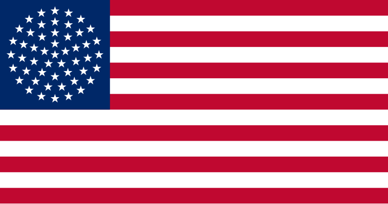
If this application for statehood is approved it would make Washington DC the 51st state of the United States of America. If American tradition is followed then a star would be added to the canton of the US flag. Since 1960 the US flag has had an even and symmetrical 50 stars which an extra star would mess up, so what patterns could be used? The Puerto Rico statehood movement use a circular design, which harks back to the Betsy Ross design of the early US flag, except it now forms a sphere.
 The problem with this is that some people don't think that there should be a star in the centre of the formation, as this would imply that some state or states are more important than others rather than equal.
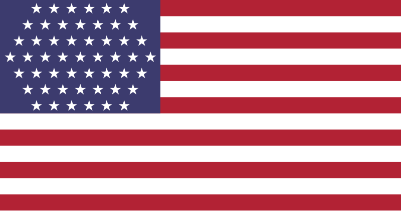
There are two other drafts that have been suggested, one with a "checkerboard" pattern
Another draft has a hexagonal pattern:

 I personally think this looks odd but perhaps thats because I am so used to seeing a symmetrical canton.
I like the Puerto Rico design. I think it tries to go back to the modern US flag roots of the Betsy Ross flag, however I think they went about it wrong. The hollow circle of stars a symbol of unity the world over possibly inspired by early American flags, notably in the European and African Union Flags. So my idea reverts to the hollow circle. Of course 51 stars is too many to fit into a single circle, but I was inspired by a variant of the 34 star flag (1861-1863) that made use of two circles:
This is my design for a 51 star Betsy Ross style US flag:
It keeps a symmetrical pattern, and all the stars are equal. In order to accommodate all the stars I had to make them a bit smaller and expand the blue canton so it now touches 9th red stripe instead of the 8th white stripe. As the hollow circle is a symbol of unity which is what the USA is probably in need of now I think the change is worth it and I think it works rather well, at least until Puerto Rico or another territory becomes a state and we need a 52 star flag lol. 

Tuesday 31 May 2016

National Museum of the Royal Navy

This idea came to me after watching a BBC documentary about the restoration of HMS Caroline, which is a veteran of the 1st World War and currently being turned into a floating museum in Belfast's Titanic Quarter. Currently owned by the National Museum of the Royal Navy, seeing the shots of the ship it struck me that no flags were flying. In stark contrast to this 2006 photo from Wikipeadia which show Caroline in her glory;
When this photo was taken Caroline was still technically a serving warship! Although she hadn't put to sea since about 1930, she was used as a training ship and base for the Northern Ireland Royal Naval Reserve. (You may notice in this picture the flag of a Commodore of the Naval Reserve is flying from the mast). She was formally decommissioned about two years ago so no longer being a warship it would be inappropriate to continue to fly the white ensign and Union Jack. I am sure this is a situation found across most of the vessels owned by the National Museum of the Royal Navy across the country. Although some (including HMS Caroline I think) might be entitled to use the National Historic Fleet ensign, i though perhaps the National Museum of the Royal Navy should have its own ensign. This is my proposal:

A blue ensign as the National Museum is a public body. The badge in the fly features a shield with a Union Jack chief, with the cross of St George in the rest of the field. This is inspired by the White ensign, the national flag flown by British navy ships. It is of course topped by a Naval coronet/crown. 
A flag variant of the shield could be used as a jack:

The initials of the National Museum of the Royal Navy are on the white field. Although in the case of a jack the civil jack would probably be more appropriate as this is in effect the naval jack (Union Jack) with a white boarder. A variant of the ensign with letters:


Tuesday 19 April 2016

Union of Commonwealth Realms

Before I start this post I would like to apologize for my lack of recent posts, this is due in part to research and study for a print publication I am currently working on, and it is taking up the greater part of my spare time, so post might be few and far between I'm afraid, but I will try to put one up every now and then.
Currently British politics is dominated (with a slight exception of regional elections in Scotland, Wales and Northern Ireland) by the upcoming referendum on the United Kingdom's membership of the European Union. As usual I am not advocating any political opinion, but I was intrigued when I seen a hypothetical scenario. The scenario was the UK leaves and forms a free trade and movement zone, between the UK, Canada, Australia and New Zealand. with certain joint institutions, rather similar to the European Union but more anglocentric. I even seen a potential flag for such a union by Zach Elsbury:
  It evokes the British ensign which not only includes the Union Flag but is the same style of flag used by Australia and New Zealand with a red field for Canada (the former flag of Canada was a red ensign). Its defaced with a shield quartered with the national plants of the four nations.
Inspired by this design I thought of having ago at a similar flag, with more emphasis of an international organisation rather than a colony. My first design was this:
Still inspired by an esign which has elements all of the four member states flags have in common,The Union Jack has official status in Canada and the UK, and appears on the Australian and New Zealand flags. it features the gold wreath and a globe. The roses form part of the cypher which is in the centre of all the commonwealth royal standards outside the UK, including those of Canada, New Zealand and Australia. The globe is from the flag of the Commonwealth of Nations. This flag is timeless as it has no direct symbolism to any individual state, meaning if a member leaves or other realms like Tuvalu or Jamacia join the flag doesn't require changing. However thinking the globe might look a little like a mock up British Empire flag, I decided to replace it with a crown, the symbol of the monarch which share:
I like this better as it is a simpler design and looks a little less cramped.

Sunday 20 March 2016

Illinois State Flag

Illinois is a state in the Midwest region of the United States of America. It was the 21st state to join the Union and is the 5th largest American state in terms of population. Like many US state flags the flag of Illinois is "Seal on a bedsheet" (SOAB) design, a plain field with the state seal in the centre. Hardly an inspiring flag for such a large state. Plus the seal emulates the Great Seal of the United States  rather than contain any regional or local symbolism.
The flag of the State of Illinois
 Although the Illinois flag stands out from the other state flags because its white rather than a blue flag, its still not all inspiring. Infact I recently read an article suggesting an alternate proposal:

New Illinois flag proposed by David Morris
There is no doubt that this flag is far better than the current one, I like the symbolism described in the article but not the actual symbols. I think this new flag looks like its from the Anglican church in the USA. I designed a different flag based on similar symbolism:
Its got blue in it to represent Lake Michigan, Three red stripes on the saltire to represent Northern ,Central and Southern Illinois, with the star representing the state in its entirety. The five points of the star representing the five nations or entities Illinois belonged to before it became its own entity in 1809: France, Great Britain, Virginia, Northwest Territory and Indiana. The four separate elements in the field can continue to represent milestone in the history of the state; it becoming a state in 1818, the incorporation of Chicago in 1833, The election of Abraham Lincoln to the US Presidency in 1860 and becoming the first state to ratify the thirteenth amendment to the US constitution (the abolition of slavery) in 1865. Red representing the the blood of the indigenous people of Illinois and gold symbolising the prairie and agricultural wealth of the state, with white representing the French colonists who pioneered European settlement in the region. (a white flag often used as the flag of the Kingdom of France). The design of the star and saltire is inspired by the flag of the United States, and makes the flag stand out from the other American State flags. 

Tuesday 9 February 2016

UK Devolved Administrations

With regional elections on the horizon this year I thought it might be interesting to do a post about the British devolved administrations. That is the regional governments of the United Kingdom who's powers are given (devolved) to them by the national parliament in Westminster. The devolved administrations are the Northern Ireland Assembly, the Scottish Parliament, the National Assembly for Wales and the Greater London Authority. I though it would be a good idea for the devolved institutions to use coats of arms. You could also include the governments of the overseas territories and arguably the crown dependencies as devolved administrations, however I am focussing on the United Kingdom administrations as the territories and dependencies generally have their own coats of arms.

Scottish Parliament 

First off I'll start with the Scottish Parliament, which although founded in 1999, is arguably the oldest of the regional governments with roots in the Estates of Parliament (the original parliament of the Kingdom of the Scots) founded in the 13th Century. The Scottish administration is the only one of the devolved administrations with the title of parliament, which is significant as that suggests where its constitutional authority and power comes from. The difference between a parliament and assembly is that a parliment governs in the name of the crown. (although you could argue the same about assemblies as they get their power from the UK Parliament who inturn get it from the crown) There are notable differences between how parliaments and assemblies operate the Scottish First Minister for example is the Keeper of the Great Seal of Scotland, whereas in Northern Ireland and Wales the Great Seal is kept by the Secretary of State of the NI/Wales Office who is a member of the UK Parliament rather than a member devolved Assembly etc etc. So as Scotland is a parliament who constitutionally governs in the name of the crown a variation of the Royal coat of arms could be used. This variant is already used by the UK government in Scotland:

As the above variant is already used I think the pre 1603 version could be used:
The full coat of arms including the order of the thistle, crest, supporters and compartment. The lesser arms simply being the shield.

Northern Ireland Assembly 

Northern Ireland was the first region of the UK to have devolution, the Northern Ireland Parliament first meeting in 1921. It was granted this coat of arms in 1924, the first and only arms granted to a devolved government in the UK:

The NI Parliament was abolished in 1973 by the Constitution of Northern Ireland Act, The Northern Ireland Assembly was established in 1998. It hasn't been granted a coat of arms, although it could claim to be the successor of the NI Parliament and as such successor to its arms it doesn't, adopting instead an emblem featuring six flax flowers:

I think governments even devolved governments deserve a proper coat of arms, and my proposal is influenced on the former arms and current logo:
The shield features the cross of St Patrick which represents NI in the Union Flag. It is defaced with a gold shield bearing the red hand that is the traditional symbol of the province of Ulster, six of whom's nine counties form Northern Ireland. The chief is blue (the traditional colour of Ireland) and features a gold portcullis ensigned with the de burke arms flanked by two harps.  The portcullis is a British symbol of nobility that has evolved over time as the symbol of government and features in the badge of the national parliament. The gold shield with red cross is that of the Hibernio-Norman De Burke family, who as the medieval Earls of Ulster ruled the province. The harp on a blue field is the arms of the Kingdom of Ireland and used on the royal coat of arms and the arms of the Republic of Ireland. The crest features an antique Irish crown out of which six flax flowers are growing. This is open to interpretation.  The lion and elk supporters bearing the banners represents the two traditions of Northern Ireland. The lion wearing the St Edwards Crown represents those whose ancestors came from the island of Great Britain in the 17th Century plantation. The lion is the main national animal of the United Kingdom and the banner is a variant of the 1606 union flag. It has the St Andrew's Cross on top of that of St George, to symbolise the Ulster-Scots majority of the planters. It is also a flag of James I/VI who was the architect of the plantation, it is also to my knowledge the only use of this variant of the Union Flag in heraldry.  The Elk with the green harp banner represents those of gaelic-Irish descent. The Elk being an ancient Irish animal and the green harp banner being a historic Irish flag. It is first recorded being flown from ships of the Catholic confederation of the 1640s and was used as a defacto national flag of Ireland by nationalists and to an extent the establishment until it was replaced by the Irish tricolour. It is important to note that while these flags symbolise national identities, they are historic flags rather than current national flags, in fact neither ever had official status. The symbolism of the two supporters representing the two main traditions supporting the shield together is evident. The same animals are also used on the former coat of arms. The compartment as well as featuring shamrocks also features stones from the Giant's Causeway. 

National Assembly for Wales 

Wales does not have a coat of arms in it's own right, it does however have two royal badges that are used by government. The first one features a red dragon on a shield which is divided into the colours of the royal house of Tudor (green and white) and is what the current welsh flag is based on. This badge dates 1953 although it has older origins. It was originally used by the Wales Office and was used by the Welsh Assembly until 2008. It is still used by the Wales Office.

The second was approved in 2008 and is based on the historic royal arms of Wales, as used by Welsh princes in the thirteenth century:
As heraldic badges go I think these are pretty sound, although I would have them the other way round. (the historic royal arms used by the Wales office as its a UK government department and the draggon by the assembly). However if the Welsh Assembly was ever granted a full coat of arms my proposal would be something like this:
The shield is like the 1953 royal badge divided into the Tudor colours, and charged with the red dragon on a grass base. The chief is divided into gold and red with the lions in alternate colours from the royal arms, and a portcullis divided into alternate colours. The portcullis symbolising government and devolution from parliament. The crest features a medieval crown with the Prince of Wales' feathers symbolizing the country was historically a principality. The supporters are of course red dragons, because its the national symbol of Wales and because dragons are awesome. The base features leeks the national plant emblem. It also feature the mottos of the two badges. "the red dragon inspires action" at the bottom and "I am true to my country" around the shield, both in the Welsh tongue of course." 

Greater London Authority 

the Greater London Authority is the government of London both the 1 square mile City of London and the surrounding boroughs and districts, although the former has a great deal of autonomy. The GLA consists of the office of the mayor of London and the London Assembly. London is governed more like a province than a city, which given its size and population and the individual councils the boroughs (some of which have or claim the title of city) and districts isn't surprising. Historically this group of municipalities which together form London has been grouped into a "county" of London:

Then this was reorganised into a Greater London Council, with more authority than a county council:
However this didn't last long and the GLA was set up in 2000. However it was never granted a coat of arms which is in contrast to the local borough councils. So here is my design for a coat of arms for the London government. 
 it is unchanged from an earlier proposal (primarily because I think its a good design). It features a portcullis which is not only in keeping with the theme of devolved assemblies, but has become a symbol of London itself being found in arms and heraldic insignia of institutions like the Metropolitan Police Service and the Army Reserve's London Regiment etc. The chief features a lion passant (like the London Council arms but in red) flanked by the lancastrian and yorkist roses which together form the Tudor rose, the floral emblem of England. The red lion symbolises strength and courage and the name "red lion" is also a popular pub name in the area. The lion supporters with the banners reflect London's position as the defacto capital both of England and the United Kingdom as a whole, 

 English Parliament

England at present doesn't have a devolved government and is governed directly by the UK parliament. This has led to instances of non English MPs from Scotland, Northern Ireland, Wales (and London) being able to vote on matters that only affect England. The government is seeking to redress this by giving cities greater autonomy (particularly northern cities like Liverpool and Manchester) and by introducing English blocking measures on English matters in committee stages of law making (although not in the voting chambour). This is rather thin stuff and a devolved English parliament or English regional assemblies, would in my opinion be better (it would also make the UK more like a federation). I have done two posts about regional and provincial assemblies. But if there is a hypothetical all England parliament what would it's coat of arms look like?
As its a parliament (and I have no doubt it would be given the title of parliament) a variant of the royal coat of arms could be used:
Like the Scottish Parliament it only uses the quarter of full royal arms relevant to it. (the three lion passants), this is within the Order of the Garter. It features the royal crest of England, has two lion supporters crowned with medieval crowns (although a St Edwards Crown would be no less appropriate I just didn't want four variants of the same crown in the one coat of arms) and the compartment/base features tudor roses.

Royal coat of arms

This was something I was doing around the same time. I was originally working on an Irish variant of the royal coat of arms for use by the Northern Ireland Office (same way the Scottish variant is used by the Scotland Office). This was the result:
The shield is quartered so that the Irish arms are in the first and fourth quarter. The collar around the shield is also that of the Order of Saint Patrick. The crest revives the historic crest of Ireland not officially used since the Act of Union in 1800, using the stag emerging from a tower with three turrets. It also features an antique Irish crown although this is part of the crest rather than an actual crown. 
But what about a royal arms for Wales? Well I had ago at that two:
simple shield of the UK but with an inner shield with the historic royal arms of Wales. This is designed to give Wales the recognition it lacks and deserves, but at the same time taking into account it was never a kingdom as such. The motto is the same as the royal motto but in Welsh. It also has a dragon supporter and a dragon crest supporting a harp. (the harp is the national instrument of Wales). 

Sunday 31 January 2016

The Boys' Brigade

Another post on the colours and uniforms of the Boys' Brigade (BB). The current system of company colours is that each company (in the UK at least) has a Queen's Colour in the form of a Union Flag defaced with the BB emblem. And a Company Colour (HM the Queen is the patron of the BB) which is either a blue ensign with BB emblem in the fly and and the name of the company in banners surrounding it. Or alternatively a St Andrew's Saltire (the brigade has its origins in Scotland) with the BB emblem in the top quarter and the company name on a circle in the bottom quarter:
Queen's Colour
Company colour (ensign)
alternative Company Colour (St Andrew's Saltire)
The problem with these is that they are very text heavy, and text is something that should b kept to a minimal on any type of flag, and avoided if possible. The fact that it is also displayed on banners rather than the field of the flag makes it hard to distinguish when the flag is moving at any distance. The second is the small badge place in a decorative circle with the name around it. It might look good as a badge, but flags are moving objects and static badges like this, especially small and over detailed don't work well for moving objects.
I redesigned the layout for company colours:
 First off the Queen's Colour. I didn't do much however I modified it to look more like Queen's Colour and less like a defaced Union Jack. The Union Flag is heraldically correct (the white fimbriation is minimal) as it often is in ceremonial standards. The central badge is also ensigned with a crown. As it is the Queen's Colour it makes sense to depict the symbol of the Queen's authority. It also makes it look more an official Queen's Colour and less like a defaced Union Jack. In this example I used the St Edwards Crown but the Crown of Scotland could also be used on Scottish flags. The Company number is below in roman numerals (most companies have names like 4th Londonderry or 1st Glasgow, even if it is the only BB company in the town it will still have a number). The Queen's colour only applies to UK companies, companies in the Republic of Ireland have the option of using the national tricolour instead, this is undefaced or unmarked in anyway.
Next the Company colour. I dropped the Union Canton, as I seen no need for a Union Jack to appear in the company colour if the Queen's Colour is a Union Flag. I did however keep the ensign layout in mind. I though the main thing that makes unit/branch flags is a unit/branch insignia or local/affiliated symbolism. So in the canton is a shield this could depict either the coat of arms (escutcheon only) of the local municipality or in cases were municipal districts have merged the former municipal arms, or if the affiliated church has its own unique heraldic insignia (as some Anglican churches do) this could be used (it must he a heraldic type insignia not a corporate style logo). Below is the company number in roman numerals. The full name is still used however one should be able to tell the company the flag belongs to by looking at the numeral and shield. The Brigade badge occupies the centre field, this is large with minimal detail to enable it to standout mote.

Next is the design for Battalion/district colours:
I thought as its a Christian organisation, it would be appropriate for battalion/district colours to be based on the crosses of/attributed too the patron saint of the region they're from. English battalions have the Cross of St George, Scottish the Saltire of St Andrew, Welsh the Cross of St David, and Northern Irish and Irish battalions use the saltire of St Patrick. The main identifying factor is a again a local coat of arms, preferably different to the one used on company colours, although in some cases where a battalion covers a single municipality there could be exceptions. In English, Welsh and Irish flags the cross is defaced with the BB emblem and the local coat of arms is placed in the canton. Whereas in Scottish and Northern Irish flags the badge is placed above the saltire and the coat of arms below. In all regions the battalion colour would be used in conjunction with the Queen's colour (or national tricolour in the Republic of Ireland) of the host company.

Same time as designing flags I was playing about with uniforms so I might aswell include them here. The boy's Brigade has had numerous uniforms that have changed quite a lot since its foundation:
The current uniform of blue shirt and tie (white shirt for officers) is a little bit minimist for the oldest  uniformed christian youth organisation. So here is my proposal:
Open in new tab to see detailed full size image
I haven't went for a radical change, its still a shirt and tie based uniform, however I have done some things to make it more regimental. I kept the characteristic light blue shirt although I did consider a darker colour as dark blue stains can easily be seen on them if the shirt gets wet. The shirt also has shoulder straps, this is for lanyards and sashes, but primarily for the type of armband. badges earned are displayed on an armband. This has been a dark blue fabric on which the badges are pined, fastened into place by a velcro strap around the arm. There are a couple of problems that can be encountered. One is that the strap can stick out and look unsightly, the other is that the armband can slip down the arm, particularly during marching when you swing your arms. I propose a brassard type armband that covers the arm from elbow to shoulder, where the shoulder strap goes through a loop thus restricting its ability to move up or down the arm. As well as badges this brassard can display rank insignia and the company name. A regional flag and battalion or district name patch is worn on the upper left arm. The shirt also has a name tag and an BB badge embroidered on a navy circle so it stands out. Khaki boyscout type trousers are worn as these look a little more formal. The tie is a simple blue tie with the Brigade emblem.
Junior (lance corporal to corporal)  Non Commissioned Officers (NCOs) wear exactly the same uniform the only distinguishment being the chevrons on their brassard. However once promotion to senior (Sergeant and Staff Sergeant) NCO comes there are some slight differences to the uniform as well as the rank insignia. A single gold stripe appears on the tie and white lanyard is worn around the left shoulder. Staff Sergeants also wear a scarlet sash. This is a tradition in the BB that has largely been dropped in recent times which I think is a shame. At this senior stage the badges such as the Duke of Edinburgh's Awards and Presidents and Queen's Badges should be being worked for and if eared are worn on an armband on the left arm.
I personally never liked the white officer's shirt, I think it looks more like an ordinary dress shirt than a uniform. So I changed the colour to tan, this again is I am sorry to say based on Boyscout uniforms. Rank insignia is displayed on slides on the shoulder straps. There are some slight differences between warrant officers and lieutenants. Warrant officers wear a blue and white lanyard and have two gold bars on their tie. There is also a white ring around the BB badge on both the shirt and tie. warrant officers who have done King George VI youthwork training to become a lieutenant have a gold and blue lanyard, and a gold ring around the BB badge as well as three stripes on their tie. These are the only officer ranks in the BB other ranks such as company captain are brevet ranks with those in that position reverting to lieutenant when they leave the post. Likewise battalion President and brigade level positions are considered as appointments rather than ranks. Therefor Captains wear the same uniform as a lieutenant the only difference being the insignia on his or her shoulder slides.
Caps have largely been dropped by most BB companies in the British Isles however I think caps are one of the things that distinguish the BB from other uniformed youth organisations like the Scouts. I did consider a khaki cap to match the trousers however I though it looked very militaristic so I changed to a dark blue one but with a khaki ridge and top. Officer traditionally wear glengarry caps which is a reference to the BB's Scottish origins. The caps are of course are only worn indoors when on parade.
Kilts may be worn on formal occasions however they should be in the Boys' Brigade tartan as recorded by the Scottish tartans authority. Alternatively the similar Sir William Smith tartan or in the case of Northern Ireland and the Republic the solid saffron tartan may be worn. Pipe bands are free to chose their own tartan.

The rank insignia is simplistic. Starting at one chevron (Lance Corporal) with the max being four (Staff Sergeant). Likewise the officers wear bars on their shoulder slides. A warrant officer wearing a single blue bar. Lieutenant wearing two, and Captains three. Until Presidents and department heads. They wear three bars but they are gold rather than blue to distinguish them from a captain. Regional Presidents are the same but also have the BB badge. Outdoors uniform is slightly different:
Outdoor dress consists of the same uniform as indoor uniform, but with a blue jumper with cap worn. Brassards, arm bands and sashes are worn on/over the jumper. For foul weather a coat is worn. It is less formal brassards and sashes aren't worn over it, NCOs may wear rank insignia on shoulder slides if they wish, but this isn't a requirement. 
I redesigned some of the badges and the layout:
Top ones on the right arm are the main badges. Physical, community and skills awards. At present different badges are awarded for the different levels. However I think it is better to denote this by placing boarders on the badge. Level 1 is the badge itself, red level 2, White level 3 and gold level 4. I redesigned the compass badge to a more heraldic compass design. I also added a specialist badge (in this case a bugle horn for a bugler) for musicians drummers and pipers will have depictions of their instruments, where as other musicians would wear a bard's harp. Duke of Edinburgh's Awards, Presidents badge and Queens Badge (Founders Badge in the Republic of Ireland) are worn on the left arm band.