Thursday, 30 August 2012

personal Coat of Arms and flag

I have come to a decision on the coat of arms issue and after much thought, debate and discussion my chosen coat of arms is this:


It corporates the ancient arms if they are that, but with the addition of white thistle and flax flowers to symbolise Scotland and Northern Ireland.The motto is above the crest in custom with Scottish heraldry.  The lions head and cornet crest have been replaced but the lion theme is continued with a salient lion and a locomotive wheel symbolising my great love of anything and everything to do with trains. The helm is sideways facing as is expected for that of a gentleman and common in the British Isles. The flag is a simple banner of the arms:  


Monday, 27 August 2012

Moon Flag

Some time ago I did a post about a flag for the Earth, this also included a 'Moon flag' Well it was suggested to include the moon symbol so I have had some spare time and here it is with the astrological symbol of the moon.
 and with the last 'Earth flag' in the canton
 or alternatively covering the hoist of the flag.

Wednesday, 22 August 2012

My personal banner and coat of arms

Coats of Arms are used to represent people, places and organisations. They came popular in the middle ages (although their origins are older) when knights were identified by the symbol on their shield and ornament on their helmet. The first flags were banners of these and some flags especially personal ones are still designed this way.   I grew up believing that my coat of arms was to quote "the ancient history of the distinguished surname McKittrick" which was printed by the Jersey Hall of Names: Black with a gold lion rampant. The crest was out of a mural cornet a gold lions head. You might notice that this is my profile picture(unless I you are reading this after I changed it)
207334_164889356899561_100001354942097_352548_1311332_n.jpg
I even went as far as basing flags on this:
McKittrick flag.JPG
Family Flag
banner.JPG
Personal Flag
The problem is there is no such things as a coat of arms for a name, and although McKittrick is not a very common name there are still quite a few McKittricks (not all related) scattered throughout the world. Unless I can prove I am the direct heir to who ever theses were granted to or made by I cannot legally or officially claim it as my coat of arms.(even if I could they would be my father's it passes to me) One of the guys at the Flags Forum Paul James was good enough to design a new coat of arms for me!
mckittrick idea1.gif
As I am about to explain it features some aspects of my old personal flag and 'ancient' coat of arms. The motto "Cito Non Temere" which is Latin for quickly not rashly has been kept. But this has been moved to the top which is traditional with Scottish coats of arms to reflect my Scottish ancestry. 
Other aspects from the flag are the locomotive wheel and the thistle and the flax flower. The wheel is in the crest because my great passion is trains and railways. the thistle reflects on the ancestral home land of Scotland where the flax flower reflects on Northern Ireland where we have lived since around 1607.
 The lion (usually meaning a warrior) has been kept however as a salient rather than rampant. The reason for this is 1) it is less common and therefore make my coat of arms more likely to be unique. 2) it fits far better than a rampant between the two flowers and 3) it can symbolise my for-bearers' charging from Scotland to Ulster. 
the Mural Cornet(again normally associated with military service) and lions head has been replaced as the crest however the lion theme has been kept as a salient lion is leaning against the wheel. The banner of the arms looks like this  
mckittrick banner idea.gif
New personal flag
 I am not completely abandoning the 'ancient' coat of arms even though I can't legally prove they belong to me. I tried to combine the old with the new so to speak like this 
Sam's Coat of Arms 3a.JPG
The problem is this is very cluttered and messy, so rather than combine them I will display them side by side like the Great Western Railway did:  
The result is this:
 Sam's Coats of Arms modern & Ancienta.JPG
Now there are two natacible differences with the motto. On the 'ancient' coat of arms I moved it to the top in the Scottish style. But this would see the motto being repeated so I chose a secondary motto. Beir the Gree which is Scots for "win the victory" a sort of inspirational thing. This is how I think I will display them on my wall. However I am not going to use it like this my primary coat of arms to use and which is what I am basing my personal flag on is the modern one: 
Sam's Coat of Arms a.JPG
Or Paul James has been very good again to make an alternative combination of both of them:
 mckittrick new idea.gif
In flag form it would look like this:
Or a combination of both his new designs:

The flag would be the same as the one above but blue. I really don't know what to go for, you comments are welcome? 


Friday, 17 August 2012

American State flags (more alternatives)


Its been a while since I posted anything but I have been kept busy. This post is a fallow up on the US State flag post I did a while back. Most American state flags don't work because of the seal on blue design which make it hard to identify them. See below:

Unlike my last USA related post I haven't focused on a 'standard' design but rather individual designs. Some are simply 'improvements' of current flag. One thing most of them do have in common is they have a single star on them. As Each state is represented by a star in the American flag I thought it would be interesting to try and feature this in the flags.
My first design is for Arkansas if you compare it to the current flag you will notice that it is really just a simplified version of the current flag. There is no text and only a single star.
Next is Florida. I have included what I would call St Patrick's Cross but on research I think that it is coincidence and the red satire design is based on the Confederate flag. The seal is to complicated to feature on the flag so a I use a plain saltire. The star at the hoist of the flag I think is a nice touch and stops confusion with the Irish St Patrick's cross.
Similarly we have Georgia. it also includes a saltire design with the star at the hoist. I based this on 1956–2001Georgia flag. However rather than going completely 'rebel' I took the same approach Florida and Alabama did, and used a simplified saltire. this still reflects the past but is not 'bound' by it.   
Next is Illinois as you can see it is inspired by the USA flag, featuring red and white bars with the state star in the canton. The eagle with the banner is taken from the state's current flag. 
The same idea is used for Kansas. The wheat in the centre reflects it nick name: The Wheat State  The motto meaning "Through hardships to the stars" also features. 
Next is Louisiana flag this is based on the historic flag of the Republic of Louisiana .
The flag of Montana is based on another alternative design which I quite liked which was the horizontal tricolour featured at the fly. 
Oklahoma is next and has a similar native American Symbol to what is on the New Mexico flag but is evidently different. Like most flags it also features a star. 
South Dakota is a simplified version of the current flag with the complicated design in the middle replaced with a star and the text removed it looks more like the 1909 flag.
The flag for the state of Washington has a portrait of the man himself which I think is quite unsuitable for a state flag. But keeping in mind the links the state has to its namesake I based the state flag on Washington's personal/command flag. But with a white boarder so that it is evidently different from the historic flag. 
For West Virginia I used the current flag as a template and used a jolly roger design from aspects of the coat of arms. The cap symbolising liberty and the spade and pickaxe symbolising the minor and farmer from it. The coat of arms also depicts muskets but I thought weapons might give out the wrong idea.  
For Connecticut I came up with the light blue field depicting a white star with navy boarder, and a white triangle pointing up with some grapes as they are featured in the current state flag. Although the grapes I feature are simplified and only feature one instead of three.
Delaware next, and again we have a simplified version of the current flag. the removal of text 'Delaware' and the coat of arms. I have however kept the date as it is very important in American history and something that has strong links to the state. Although I shortened it so only the year (1787) features.  
Nebraska is actually based on the Texas flag but with the addition of another red bar and the state motto in text. 
Oregon is unique as it has a two sided flag. This is something I have tried to embrace as it is part of the tradition for the flag of that state. The reverse of the flag (bottom image) featuring the beaver is something that is unchanged although the two gold bars featured on the front are also on the reverse to give both sides some uniformity. The Front of the flag is changed completely with a simple star and the date 1859 which is an important date in the history of that state.
Wyoming possibly has the worst flag featuring a buffalo and seal. I decided to keep the buffalo, although in a far more simple and recognisable form, which is the head only. The red white and blue design I think works well and a star in the canton of the blue looks really well. 

Saturday, 21 July 2012

New Australian Flag

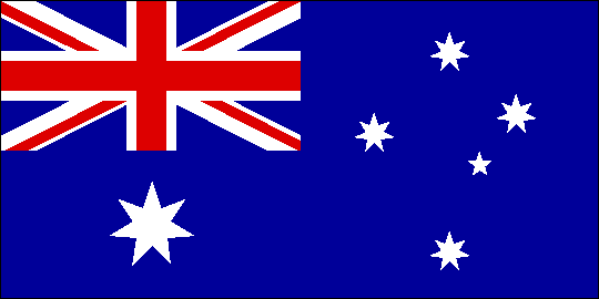
The topic on weather or not Australia should change its flag form the traditional British Ensign is a hotly debated subject and political mine field in Australia. From what I have read most Aussies are content with their current flag for the mean time. Personally I like the Australian flag but if the Aussies ever voted to change it what would it be?
This was my original design. As you can see it has most if not all the characteristics of the current flag. The Southern Cross Star formation, Commonwealth star and a red cross similar to St George's Cross. It also has the Aussie Colours of Green and Gold. Native Aboriginal colours of red, yellow and black, and the British colours of red, white and blue. Two more aspects of this design is the boomerang shape with the aboriginal colours in the canton, and below that you can see part of the make up of the Union Jack, but not a whole one. These symbolise the two main Australian communities the ones descendent form Aboriginals and British Settlers.
Personally I thought this although interesting was very complicated. So I retired to studying the Australian flag.
   
The three main consonants of this is the British Union Flag in the Canton, the Commonwealth Star under it. This symbolises six Australian states and the seventh point is for all the Australian territories that aren't part of the mainland. Towards the fly is the southern cross star formation which can also be seen on the similar flag of neighbouring New Zealand. The bit on this flag that the pro-new flag people don't want is the Union Jack as this symbolises British Sovereignty, this is probably not surprising as Australia was part of the British Empire when this flag came out. However today Australia is fully independent so some people say the flag is out dated. Others say it was the flag Australians have fought and died under and link to their ancestors and mention that the Queen is head of state of Australia and other countries in the Commonwealth.  
I decided to remove the Union Jack if only to see what it would look like without it. I didn't think it looked too bad. I moved the Commonwealth star up to the centre and it looked better. Then I thought about changing the colour. Green and Gold seemed the most appropriate. This was the result: 
It is clearly Australian and is based on the traditional flag. The other advantage for this flag is that in keeping with Australian tradition, the colour can change for sea. Currently the State Ensign is the current flag. The Civil Ensign is the Australian Red Ensign and the Naval Ensign is the the Australian White Ensign . For example the new ensign of the Royal Australian Navy might look like this:  
Alternatively the stars could be blue.
My friend Leonardo Piccioni from the Flags Forum also designed a version shown below:  
 australia1.png
This is the civil version he had the idea that the government version should include the Commonwealth star and the Civil one only the Southern Cross.  Me and another form user 26 May 1989 (who is Australian) think that although the Kangaroo is a great Aussie symbol it is rather Corporate which is not good for a national flag. Now the reason I included Leonardo's design is because I used it as a template for the next design:
State Flag
 
Civil Flag

As you can see I removed the Kangaroo. In terms of colour the only colour this would change is white for the Navy, as at sea both Gov and Civil ships will use either the State or Civil versions. Although the Civil flag looks a little plain I think after use it would 'grow on you' but I think there are lots of alternatives that should be considered. to see the flags forum discussions on the subject click HERE