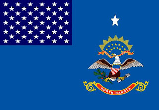
Because there are so many states I think it would be a good idea to introduce a standard design for State flags, that both represent the individuality of the state and its Nationality aka American. For example most UK overseas territories use a deface blue ensign with the regions coat of arms(see link).
While this is not idea for ALL US States as many don't have coats of Arms I think it is a good place to start. I propose the fallowing standard design:
It is clearly influenced by the standard design of flag for UK Overseas territories. I should highlight at this point that I am not comparing states to territories. The 50 stars in the canton symbolise the sovereignty to the whole USA. The single star symbolises the state, and the coat of arms is self explanatory.
I have made a couple of flags loosely based on this standard design:
Delaware
Michigan
Nevada
New Jersey
New York
North Dakota
Pennsylvania
Utah
New England presents a good opportunity as it is not a state but a body of states. So I have developed flags representing their New Englander identity. I have developed state flags based on defaced historic New England flags and ensigns:
IdahoMaine
Massachusetts
New Hampshire
Vermont
There are two states which have coat of arms that I left out. Because their coat of Arms are relatively simple and work well in the form of a banner for this I designed a standard version and banner based version:
Alabama standard state flag (top) and banner (below)
Missouri banner version (note I replaced the USA seal with a star and added the red, white and blue design from the original flag. As I feel that the USA seal need not appear on it but that's just my personal taste.
I will make another post on other state flag ideas.


.jpg)


Most American flag lovers are trying to the opposite of what you suggest. Half of the 50 states have the "Blue with seal" flag and most people can't tell which is which. Instead of making them more alike, we need to make them more different. But fun exercise, even if it makes ones' eyes water! Not sure how Idaho snuck into New England;-)
ReplyDeleteThe problem with American Seals is that they are overly complicated. While this looks impressive on official documents it is not really ideal for flags. Coats of arms as I said are not ideal but giving the size of America and the amount of states it is an interesting starting point and it is fun, as for Idaho sneaking into New England you will have to forgive my ignorance I'm not an American but like flags. I have been working on a slightly different approach to US state flags which I will be posting the results of in a day or two.
DeleteOne of the theories I've heard about the complexity of flags is that it needs to be something eight year olds can draw. I like your starting idea about my home state of Missouri but like to use more of the existing elements. Blue white and Red representing the united states but at the same time the motherland France for the territory we are from. the circle w/ stars representing our place in the union. I would change up and use a larger star at the top of the circle represent our state. In the center instead of the complicated state seal I would just add a wiggly line for the Missouri river and a fleur de lis for our French heritage.
ReplyDelete