Showing posts with label City Flag. Show all posts

Friday, 24 July 2015

City of Pocatello

Given that yesterday the (community) flag of Birmingham, was officially added the Flag Institutes register of British flags and "ceremonially" raised, I think I'll start a new flag for the city which by far has the worst flag in history, ranking at the bottom of the North American Vexillological Association's list of city flags. I am of course talking about Pocatello, in Idaho, USA.
Yes that is their flag, and yes that is a Trade Mark symbol, and yes that is a copyright statement! Not only have they broken the rules and guidelines of vexillology, they tore them up and used them as toilet paper. This is without doubt the worst flag I have ever seen. It even beats the Milwalkee flag, which has a flag on the flag. The seal is not much better either:

So I decided to have a go at fixing these, first of all the seal looks like a corporate stamp, rather than something used to officiate local government documents. This is my alternative design:
 It features a coat of arms I based on the purple  mountain symbol of the flag. the sky is gold to reflect that the city was founded as the first stop on the railway during the gold rush. The crest is a Native American war bonnet as worn by a chief, a reference to the city's name. The city is named after chief Pocatello of the Shoshoni Tribe who gave the railway right of passage through his reservation. I did think of adding my ferroequinology crown to reflect the railroad which seems to have played an important part in the foundation, but thought it might take away from the feathers, so I decided against it.
The flag is based on a banner of the coat of arms but turned onto its side:
The mountains make up the field and the sky make up the hoist giving it a rather unique twist.
It is certainly way better than the current flag, if nothing else.

Saturday, 24 November 2012

Belfast City Hall Flags Issue

Belfast City Council policy and resources committee has recently came to the conclusion that the National Flag of the United Kingdom the Union Flag should no longer 'fly' over Central Council Buildings in Belfast.
These buildings include the City Hall, Ulster Hall and the Duncrue complex. Currently the Union Flag is 'flown' over these buildings 365 days a year. However this is not the end of the case as Belfast City Council has to pass the motion which will be debated in council on 3rd December. for more on this story visit Ulster TV
Now I do not in any way support the complete removal of my national flag from a local government building. But it is interesting to note that while Belfast Council use the flag every day the Northern Ireland Assembly only use it on parliament buildings on designated days and public holidays, for example HM the Queen's Birthday, St Patrick's Day and 12th of July etc. Out of 365 days Parliament Buildings at Stormont only use the Union Flag 12 days a year, the rest of the time there is a bare flag pole.

Now I agree with the designated days policy to an extent but I do not like the idea of a bare flag pole. For Parliament buildings I would propose a New Northern Ireland flag be used the 353 days the Union Flag is not used. To see some of my proposals click here and here.

As for Belfast Council buildings I would propose that a City of Belfast Flag be used the 353 days the National Flag would not used. I think the best option is a banner of the Belfast coat of arms below:


The flag should look something like this:

I do not own these designs. All your comments are Welcome.

Wednesday, 26 September 2012

City of Natal

My friend from the Flags Forum Leonardo Piccioni published on his blog some ideas for a new flag of Natal. Natal is the state capitol of the Brazilian state Rio Grande do Norte. The current flag is below:
The Coat of arms has a meaning. Natal means Christmas, reflecting on the date the city was founded. The star design appropriately depicts the star of Bethlehem, The biblical star that led the magi to the infant Jesus Christ. Leonardo noticed some Brazilian heraldic rules were broken by these arms. Acording to him they are as fallowed: 

  • The mural crown shows nine visible towers, while, by a standard inherited from Portuguese settlers, a city should use a mural crown with five visible towers.
  • Being Natal the capital city of  Rio Grande do Norte, this mural crown should be golden, in recognition of this special status.
  • The coat of arms is placed in a English shield shape, while a Spanish escutcheon should be rather used.
The obvious solution is a banner of the coat of arms but where would the fun be in that?
Leonardo's design simply corrects these errors:
designed by  Leonardo Piccioni

I have taken this further and made a couple of new designs. The first designs feature both a simple version of the arms showing only the shield and a version with the full coat of arms. 
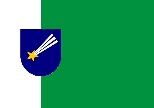
The first one takes the colours of the current flag and forms a green and white vertical field rather than horizontal with the arms at the hoist separating the two colours. 


The next design really is based on the current flag with the arms moved towards the hoist which I think works better when the flag is in use than if they were in the centre. 


The next flag is based on the American stars and bars flag. but with the bars changed to green and white and the banner of the coat of arms in the canton. 

Again I took this one step further with moving the banner of Natal to where the white bar is and placeing the state flag in the canton. Now the state flag I used is not the official state flag but a proposed replacement designed by Leonardo. The reasons I used this are:
  1. In my opinion it is better than the current flag.
  2. It works better in my flag than what the current state flag does.

I also thought when making this why stop at state? Why not put the Brazil flag in?

The problem I have with this is that the Brazil flag is too complicated and the colours don't work, but this can easily be corrected. 
In this design I simplified the Brazil flag by removing the stars and the text. and changed the blue in the field to match that in the canton. I did not change the green as I think it works better with too shades to make the canton stand out from the flag. 

All designs are mine unless stated otherwise. Comments are appreciated. :)


Monday, 17 September 2012

Londonderry Flag

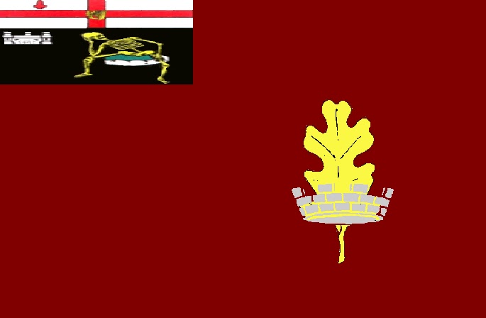
This idea really only came to me from a post on a different blog about a new flag for the city of Liverpool. Being a Liverpool FC fan I thought I would have ago too. Then I thought about what about my own city Londonderry? Londonderry(aka Derry, Dorie(Irish) Lunnonderrie/Derrie(Scots) the walled city and the maiden city) is one of the most ancient and historic places in Ireland. It is Northern Irelands second city and is set to be the first ever UK city of culture in 2013, so it seems right we should have a decent flag. The flag currently flown over the Derry City Council offices (not the Guildhall where council sits which has no flag pole) is this:

This is a very simple flag with two main features, the city coat of arms and the crimson field. I will explain both.

First off the coat of arms. the most ancient part of the arms consist of a black shield with a skeleton sitting on a mossy stone with a castle in the background. No one really knowns the origin of these.  

  • A suggestion has been made that the castle is related to an early 14th century castle in nearby Greencastle belonging to the Anglo-Norman Earl of Ulster Richard de Burgh.
  • The most popular theory about the skeleton is that it is that of a Norman De Burgh knight who was starved to death in the castle dungeons in 1332 on the orders of his cousin the above mentioned Earl of Ulster. Another explanation put forward was that it depicted Cahir O'Doherty (Sir Charles O'Dogherty), who was put to death after Derry was invested by the English army in 1608. 
In 1979, Londonderry City Council, (before the council changed its name,) commissioned a report into the city's arms and insignia, as part of the design process for an heraldic badge. The published report found that there was no basis for any of the popular explanations for the skeleton and that it was "purely symbolic and does not refer to any identifiable person"
The next cheif of the arms bears the arms of the city of London. It was the London Guilds who funded the reconstruction and plantation of the city and the building of new walls(which still stand today) and a new charter in 1613. (hence the name Londonderry). A Harp was added to the centre of the cross, this is sometimes forgot about, and in the past has been dropped completely In 2002 Derry City Council applied to the College of Arms to have the harp restored to the city arms, and Garter and Norroy & Ulster Kings of Arms accepted. The harp sometimes appears on top of the shield. In Loyalist and Unionist interpenetration's a crown might appear on top of the arms both with and without a harp. Although no crown was ever offically added to the official armsThe motto Vita Veritas Victoria is Latin for life truth victory. . The cities arms are often flanked with flags,banners and weapons. Below is a carving from inside the city Guildhall it depicts cannon, swords spears and muskets and colours flanking the shield. the four flags in this case are a British red ensign representing that Londonderry is a port. the blue flag with gold harp is a traditional flag of Ireland, and the dark crimson ones in the background I will come to next.
 

The Crimson flag is also part of the Derry tradition. To understand it you need to know that in 1689 the city withstood over 100 days of siege. It was the third and last attack on the walls(which have never been breeched hence the maiden city) During this conflict a crimson emblem was displayed on the walls and later on the Cathedral as a symbol of defiance to the attackers. It features in George Folingsby's painting the Relief of Derry symbolising relief ships lifting the siege. It is belied to have been dipped in blood hence the crimson colour. This colour is known as 'Derry Crimson' and the colour of school blazers, council vehicles
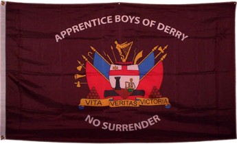
   and the sashes of the Apprentice Boys of Derry Clubs who hoist the crimson banner on the Cathedral and carry it as a colour at the anniversaries of the shutting of the gates and relief celebrations every year.

Top: Crimson Flag flown from St Columbs Cathedral the establish city cathedral (there is a second Roman Catholic one outside the walls) Above Bottom: a crimson Apprentice Boys flag.

The city of culture flag looks like this flown from the Derry-Londonderry round the world race yacht as you can see it is rather operate so I believe we need a better flag to show the world.: 
Not wanting to abandon the coat of arms or the crimson banner I decided to use both I used a banner of the arms in the council logo:
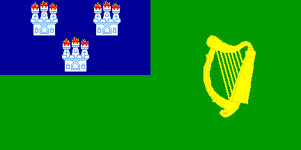
I used a design similar to the flag of City of Dublin shown below:
 
As you can see a banner of the arms appears in the canton of the design. My designs are below:
 Arms in canton
Arms at hoist

This is a little bare so I added the red hand of ulster 


However I don't think it works so a harp on a blue shield seed logical as it is another shield often seen in the Guildhall. 


The problem with these shields are that it might say Ireland, Northern Ireland or Ulster but not Derry. so I needed a badge and walking in Guildhall square I saw it on the walls. 

An oak leaf symbolising the city origins with a bastion symbolising the ancient walls. I incorporated it in the flags


I also made an elongated version for use as street banners on lampposts: 


The new designs belong to me. All comments welcome