The website FreshNI can be found here.
I would like to share the designs, which are interesting and generally rather good, and offer some comments.
Northern Ireland
First off is the Northern Ireland (or Ultonia from the latin for Ulster as the website thinks is a more distinct name, I will continue to use Northern Ireland, Republic of Ireland and Ireland for the island so as not to overtly complicate things) flag proposal:All these designs are attributed to Palomca, who is responsible for a number of NI flag designs, but
this is what he considers his best. It is rather good in that it is simple and not at all complicated, with minimal colours. The only suggestion I would make is to colour the central hexagon (a reference to both the six counties and the Giant's Causeway) possibly gold (red and gold are colours associated with the province of Ulster):
As well as a flag a coat of arms is also proposed:
As seen in the image its really a modified variant of the former Northern Ireland coat of arms but with the design changed on the shield, and a few other modifications. I particularly like the compartment with the arrangement of six shamrocks and six flax flowers. I like the Ulster-Scots reference in the flag staffs, something I have also alluded to in one of my NI coat of arms designs, although more directly with a St Andrew's Saltire:
 |
| too much! My design |
Overall I approve.
Republic of Ireland
It is suggested that the Republic of Ireland change its flag to a gold saltire on green field defaced with the harp from the state coat of arms:
The only problem I have is that the coat of arms in the middle belong to Leinster. The Irish arms are a blue shield:
I would change the colour again which emphasises the central emblem and it keeps the colours to a minimal of three.
The rational behind this is that the tricolour is not a distinctive design the same way the stars and stripes or Union Jack is. Where as this is, change the colours to black and white and this is still a recognisable flag.
At first I was sceptical about a gold saltire. I have seen various flag design including a saltire to mimick St Patrick's cross, including blue, white and green crosses. This is not really how heraldry works, and I was fearful that this flag might be another example of these poorly planned designs. St Patrick's Cross specifically a red saltire.
However this design is a rather effect combination of symbols, including the harp, the tricolour and St Patrick's Cross. The gold colour of the saltire comes from mixing the orange of the tricolour with the red saltire to make gold, which fixes the problem of a meaningless saltire.
Green and gold are also distinctive colours in Irish nationalism.The only problem I have is that the coat of arms in the middle belong to Leinster. The Irish arms are a blue shield:
I would change the colour again which emphasises the central emblem and it keeps the colours to a minimal of three.
Ireland
There is no universally accepted formal flag flag for the island of Ireland. This has lead to sporting organisations and other all island and cross boarder bodies using a variety of flags often unique to their organisation.
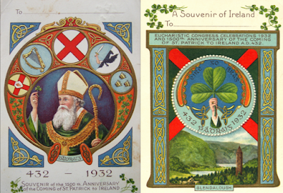
According to the website Palomca's main influence in this design were souvenirs from the Catholic Eucharistic Congress of 1932, when they celebrated 1500 years since St Patrick brought Christianity to Ireland. Both feature St Patrick's Cross but on one the field is green, and he simply improved upon it by observing the rule of tincture:
What I really like about this design in conjunction with the other two, is that it looks like a combination of the Northern Ireland and Republic of Ireland flags. I don't know if that was intended but nonetheless its an effect I really like, and if these two flags were adopted would make this design a perfect all island flag.
Ulster-Scots
The design of a Ulster-Scots flag features a St Patrick's Cross combined with that of St Andrew, a theme that has appeared on other flags from Ulster. Being from that proud stock of people myself I am sympathetic for an ethnic flag. The design in question also features a red hand of Ulster and red lion of Scotland:
I think the positioning of the red hand and lion is a little odd, personally I would place them on the top and bottom quarters so that they have a more central position:
I personally think this is a better variant of the design but I still think it looks odd. The combination of Scottish and Ulster symbols is not an easy one, and the flag would look quite distinctive without the hand and lion so I would suggest dropping them and sticking with the saltires. Or if you want to reinforce the Ulster symbolism just drop the lion. I think most Ulster-Scots my self included have a deep attachment to the red hand (which is odd if one considers its history) that we don't have to the same degree for the lion rampant.
Well thats it, please feel free to comment and make sure you visit the website for yourself. Many thanks to Palomca for allowing me to post and share his material.


.svg/2000px-Flag_of_Scotland_(navy_blue).svg.png)

